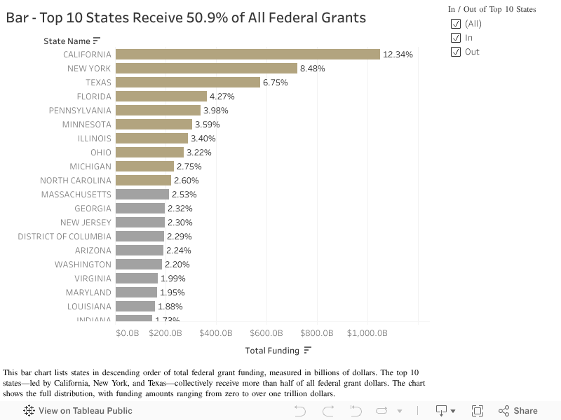
Drill into recipients to see who has the most findings.
AGA . Datathon 2026 - AuditsMadeSimple
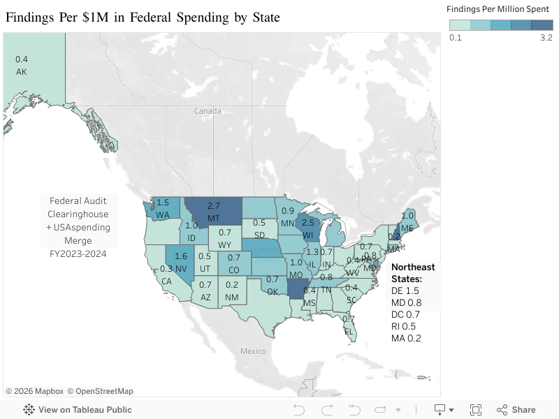
We combined three official datasets to build this view. Understanding what each system tracks, and misses, is critical for analysis.
This is the official open data source for federal spending information, answering who received the money, how much was obligated, and which agency funded it. It does not show whether the money was used effectively.
This is the central repository for Single Audit reports filed by recipients of federal funds, useful for checking recent findings, material weaknesses, and the auditor’s opinion. It does not provide real-time daily spending.
This is the primary database for entity registration and debarments (exclusions), helping you check if an entity is debarred, its UEI (Unique Entity Identifier, a government-wide identifier for entities), and whether registration is active. It does not provide transaction history.